
Lettera Text
Lineto.com
2012


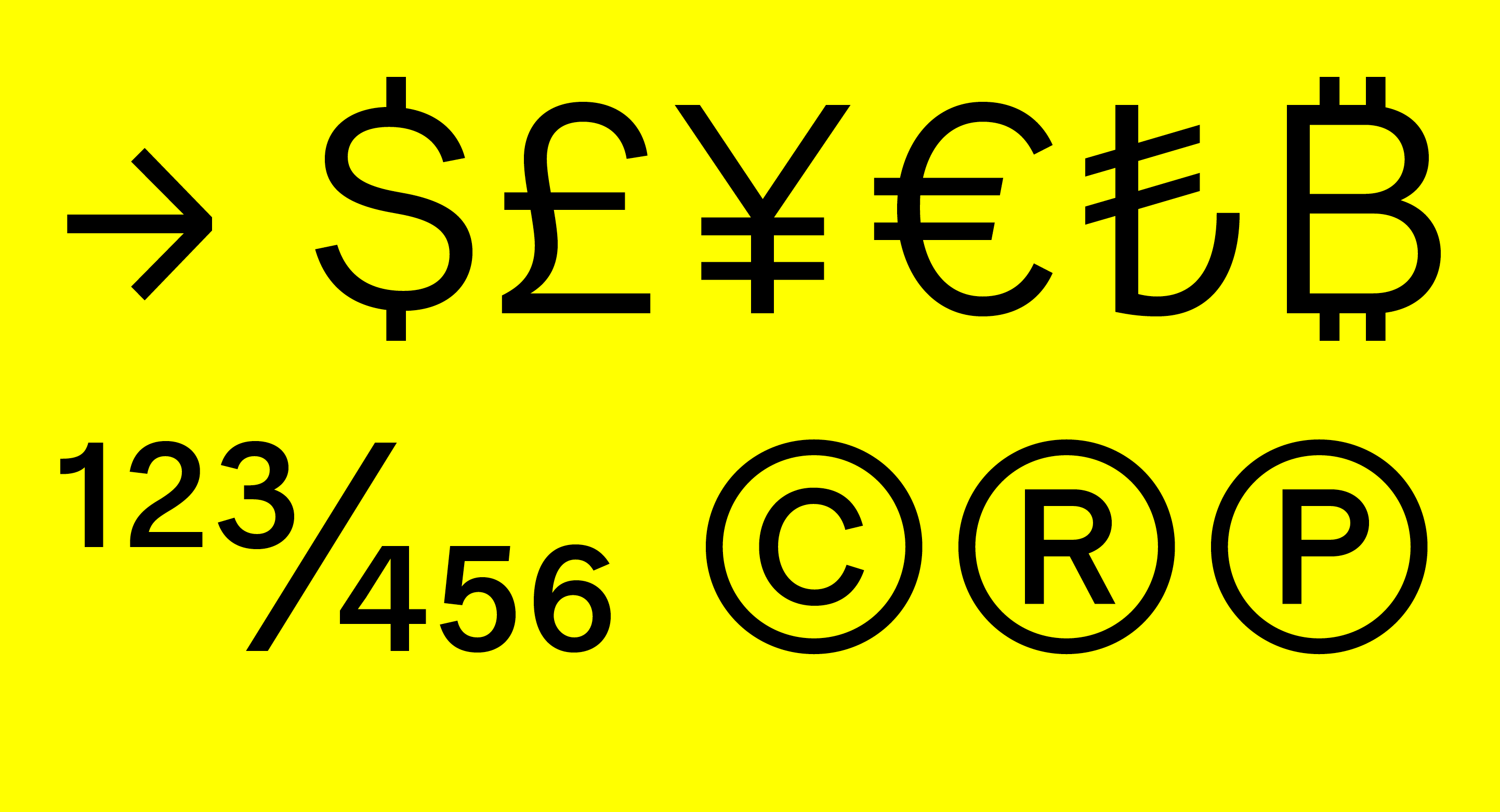


The proportional version of the monospaced font Lettera Mono, developed initially for the book Dieter Rams: As Little Design as Possible, and is used throughout the book exclusively.
Following the release of Lettera, users expressed a strong demand for a non-monospaced text version of the font. Lettera Text retains the freshness and unique appearance of Lettera, and functions extremely well in long small texts, as well as large display sizes.
Lettera Text is available in ten cuts, as an OpenType Standard and Pro, including stylistic sets, alternate glyphs and numerals sets, and extended Latin support.
For more information on Lettera Text, please see here.
︎︎︎ Download specimen (PDF)
Lettera Mono
Lineto.com
2012


Initially drawn for the book Area 2, and is used throughout the book exclusively. The font is based on a single weight basic specimen of a mid 70‘s typewriter font designed by Joseph Müller-Brockmann for Olivetti.
Lettera is available as an Extended Latin OpenType format, including eastern European, Turkish, Baltic scripts, and alternate glyph. The specimen used for redrawing the first weight was a lo-resolution scan. When blown up large, it showed what appeared to be “reversed” ink-traps in critical joints of some glyphs.
These elements that guided the design and later turned out to be a mistake caused by the poor quality of the document, remained. Lettera was later developed into a proportional version, Lettera-Txt, also available at Lineto.
For more information on Lettera Text, please see here.
︎︎︎ Download specimen (PDF)
Gravur-Condensed Hebrew
Lineto.com
2006
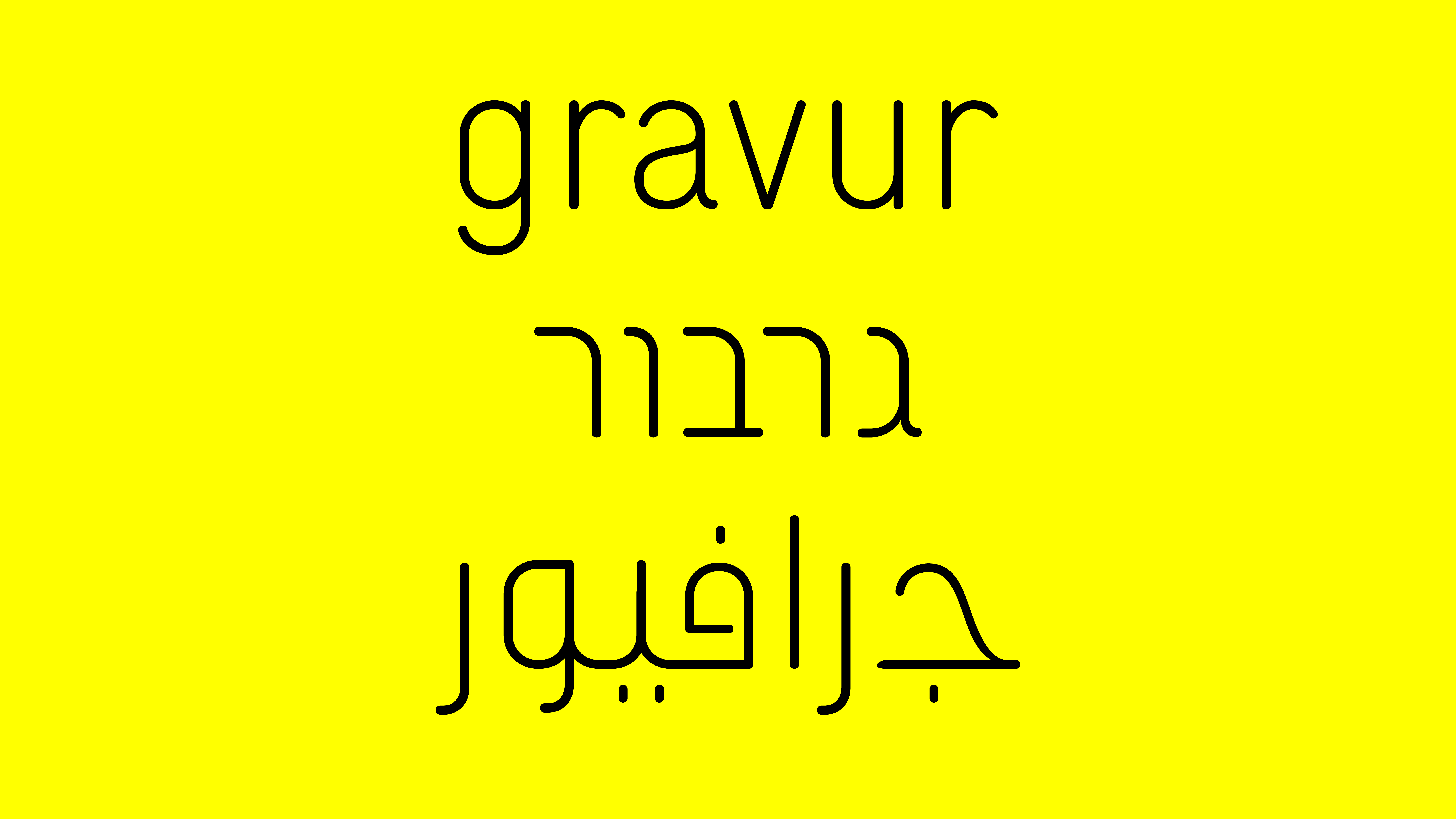


The Hebrew version of the Lineto font Gravur-Condensed, designed by Cornel Windlin and Gilles Gavillet.
The font has been in use, along with an Arabic companion in the Stephen Shore book From Galilee to the Negev.
The font has been in use, along with an Arabic companion in the Stephen Shore book From Galilee to the Negev.
Diogenes Didot
Diogenes Verlag
2016

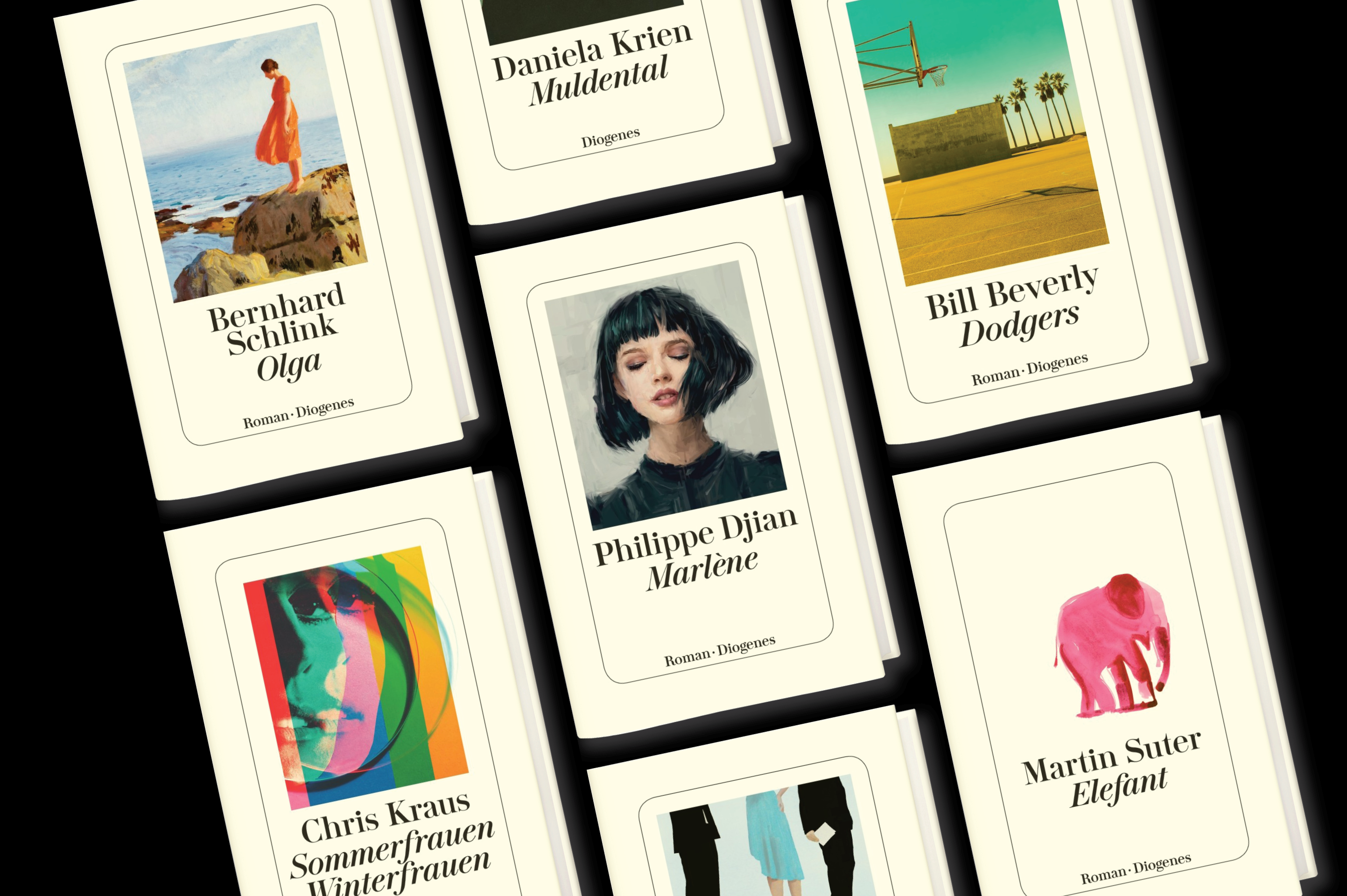


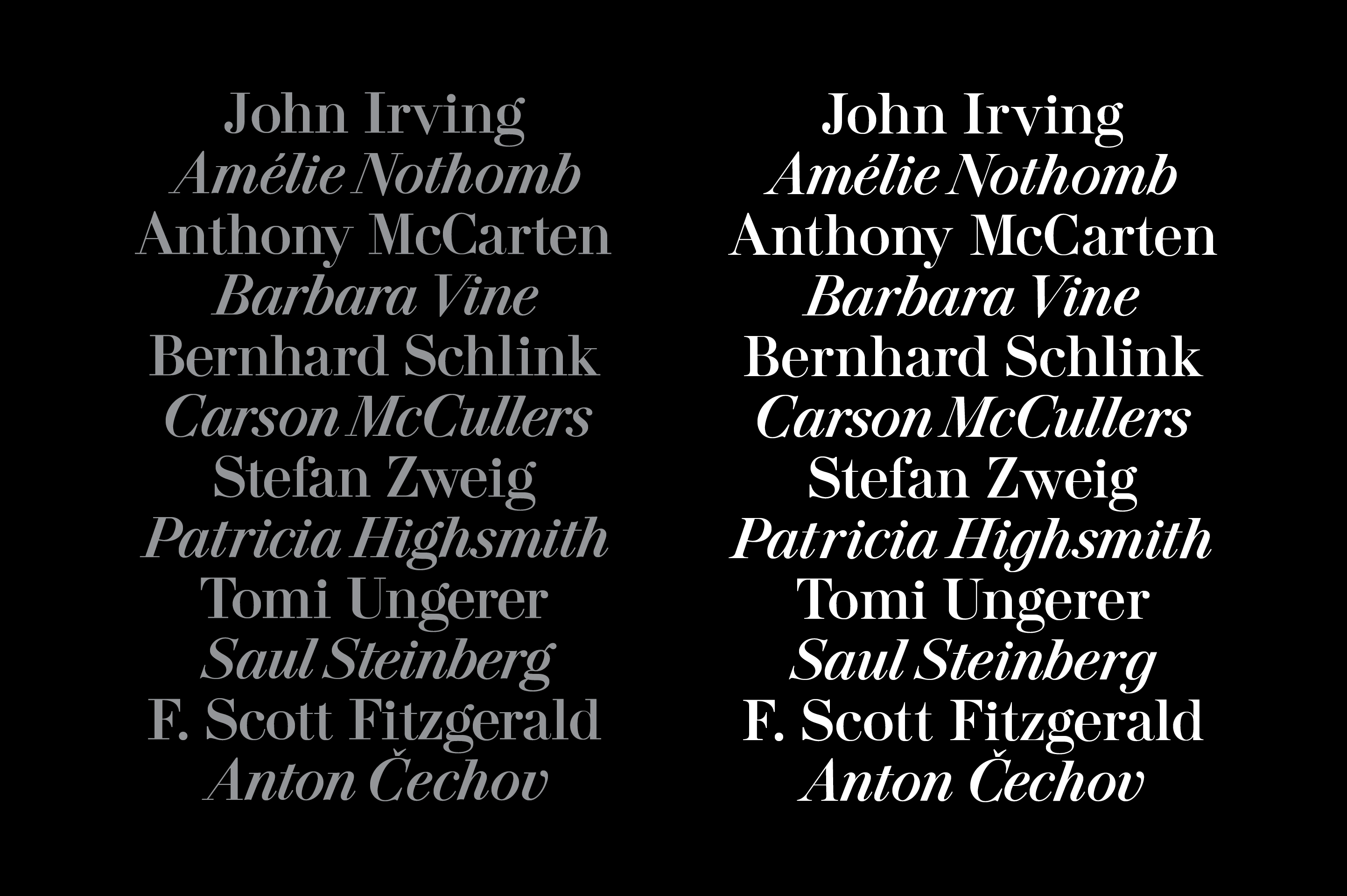


The timeless look of Diogenes Verlag's books is owed mainly to the stark white covers, the iconic thin frame, and—not least—the ownable 'Didot' font used on all literature titles.
In the pre Macintosh era, the Swiss publishing house used to set its covers using a roll of Staromat tape with a special 'Didot' cut - the tape was owned by the Basel-based company 'Werbstatt', and the publisher would pay 3 cents pet letter to have a printer film made with the cover's typography: Roman for the author's name, and Italic for the book's title.
Later on Diogenes bought the actual tape and was free to set any cover with no extra hassle.. In the nineties, the font got—rather poorly—digitized, and the tape was no longer in use. In 2016 I set out to redraw the font, based on the tape that still reside in the publisher's offices, with a small update to the classic Didot serifs - giving it a more of a 'Scotch' flavor.