
Lettera Text
Lineto.com
2012


The proportional version of the monospaced font Lettera Mono, developed initially for the book Dieter Rams: As Little Design as Possible, and is used throughout the book exclusively.
Following the release of Lettera, users expressed a strong demand for a non-monospaced text version of the font. Lettera Text retains the freshness and unique appearance of Lettera, and functions extremely well in long small texts, as well as large display sizes.
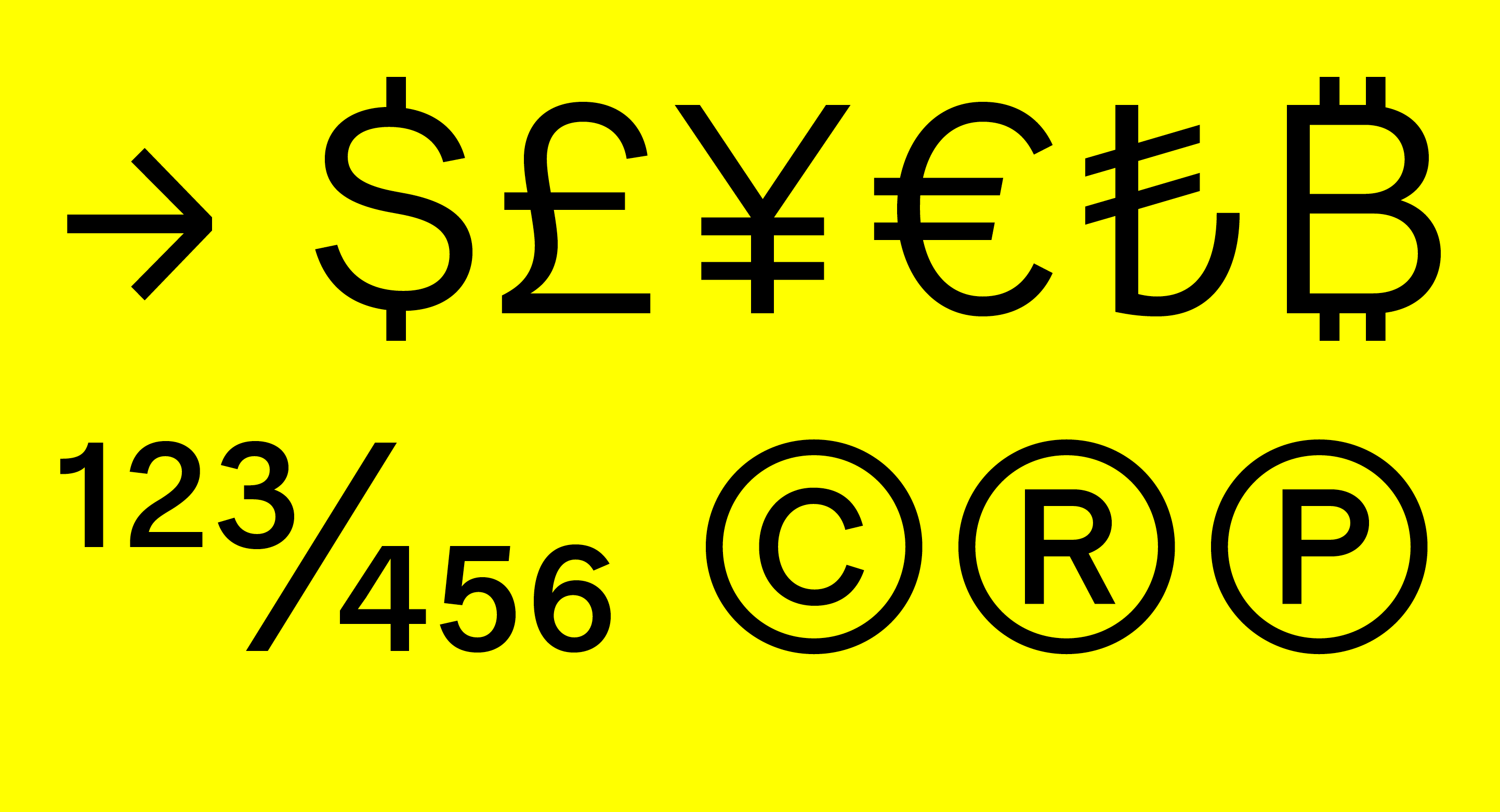
Lettera Text is available in ten cuts, as an OpenType Standard and Pro, including stylistic sets, alternate glyphs and numerals sets, and extended Latin support.
For more information on Lettera Text, please see here.
︎︎︎ Download specimen (PDF)
Following the release of Lettera, users expressed a strong demand for a non-monospaced text version of the font. Lettera Text retains the freshness and unique appearance of Lettera, and functions extremely well in long small texts, as well as large display sizes.
Lettera Text is available in ten cuts, as an OpenType Standard and Pro, including stylistic sets, alternate glyphs and numerals sets, and extended Latin support.
For more information on Lettera Text, please see here.
︎︎︎ Download specimen (PDF)